


The Dashboard Fallacy: When Seeing Everything Means Understanding Nothing
Dashboards promise clarity. What they often deliver is noise, confusion, and a false sense of confidence.

Fellow Data Tinkerers!
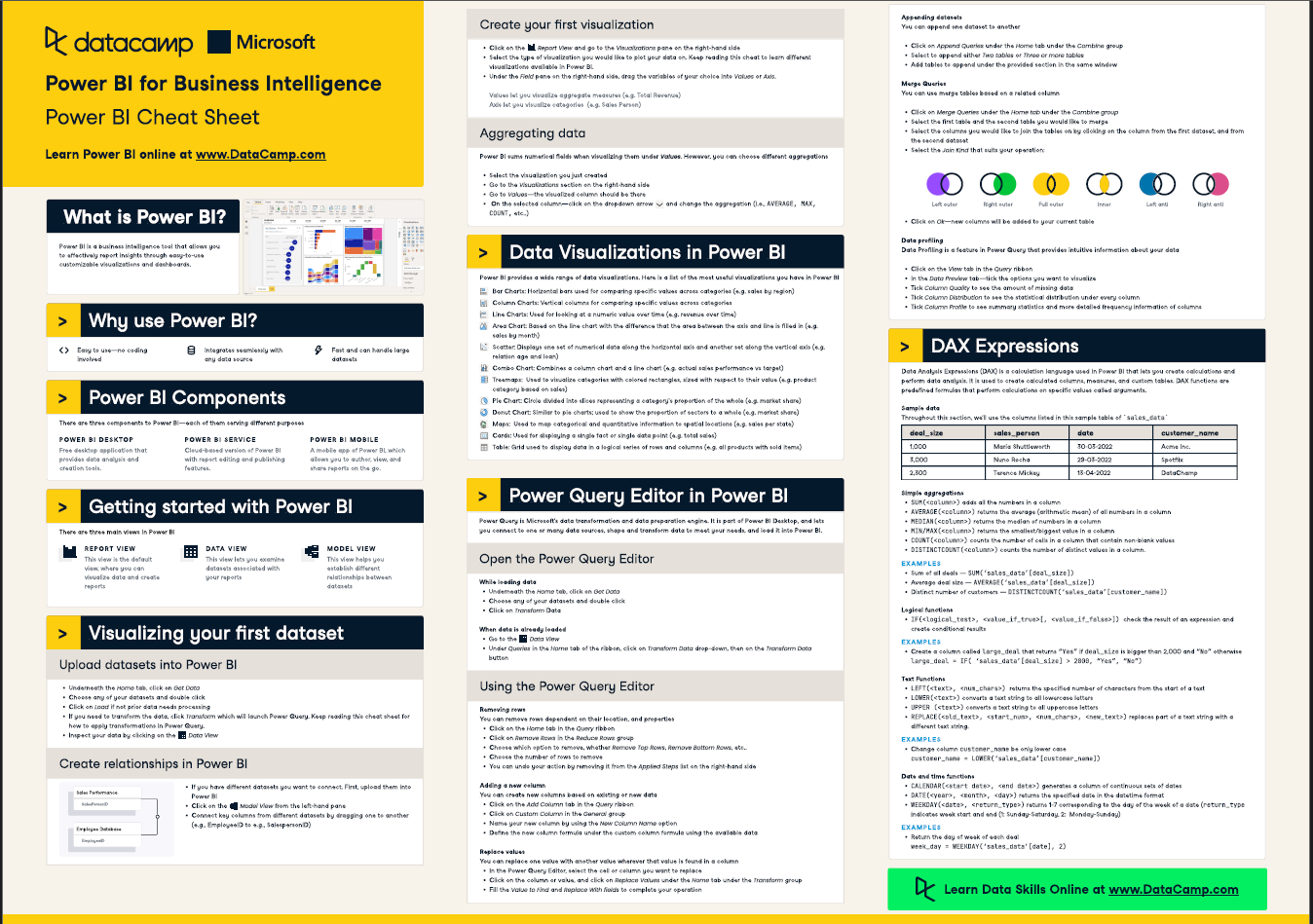
As I mentioned earlier this week, you can have access to 100+ cheat sheets covering everything from Python, SQL, Spark to Power BI, Tableau, Git and many more. You just need to share Data Tinkerer with 2 other people to unlock it
So if you know other people who like staying up to date on all things data, please share Data Tinkerer with them!
Now, without further ado, let’s get into a fallacy you want to avoid!
“We don’t need a data team. We’ve got dashboards.”
— someone, somewhere, right before a very expensive mistake

Dashboards are everywhere.
They’re in all-hands meetings, pinned to Slack channels, looped on TVs in the office. There’s a dashboard for product KPIs, one for traffic sources, one for the latest cohort performance, another that just says “ENGAGEMENT” in all caps with three gauges spinning like a casino.
At some point in the last 10 years, dashboards became synonymous with “being data-driven.”
But here’s the uncomfortable truth: most dashboards don’t lead to better decisions.
They lead to confusion, misinterpretation, and in the many cases - nothing at all.
This is the Dashboard Fallacy: the belief that building dashboards leads to insight. That visibility automatically translates to understanding. That if the data is there, people will know what to do with it.
Dashboards are not decision tools by default
At their best, dashboards give people fast access to trusted numbers and help monitor systems in real time.
But in most orgs, dashboards fall into one of three categories:
The Vanity Wall: Charts that track metrics no one owns, cares about, or remembers asking for
The Weekly Screenshot Ritual: Someone pastes the same dashboard into a slide deck every week, and no one reads the slide
The Self-Serve Cop-Out: An answer to every question is “the dashboard is there if you want to explore”
The problem isn’t just that these dashboards exist. it’s that teams believe they’re being informed by them, when in reality they’re surfacing noise with no narrative.
The illusion of clarity
Dashboards give you the illusion that you understand what’s going on.
After all, the metrics are updating. The arrows are pointing up or down. There’s color-coding. That must mean something… right?
But ask anyone on the team:
“What would it take for this chart to change? And if it did, what would we do?”
Most people can’t answer.
That’s the real cost of the dashboard fallacy—not just misinterpretation, but a false sense of confidence in numbers that aren’t being used to guide action.
Common dashboard traps
Here are a few ways dashboards silently derail data-driven thinking:
1. Metric overload
If your dashboard has more than 10 numbers on the screen, it’s probably just a metrics graveyard. Decision-makers don’t need 25 metrics. They need 2-3 that actually matter this quarter.
2. Stale charts
No one’s looked at that funnel conversion chart since the feature was deprecated. But it’s still updating, still coloring red when the rate drops, and still tricking someone into thinking it’s meaningful.
3. Ambiguous filters
You change one filter and all the numbers shift. Suddenly, your signup rate dropped by 12%. But is it broken? Or did you just switch from “All Time” to “Last 7 Days”?
4. Charts without context
The metric went up. Or down. Is that good? Was it expected? Is that a normal seasonal trend? Dashboards rarely tell you that part.
What good dashboards actually do
The best dashboards are more than just “views into data.” They’re tools built around real decisions.
They typically do a few things right:
Align to a specific question or team ("How is retention trending in our newest market?")
Prioritize actionability over comprehensiveness
Include clear definitions of metrics, not just labels
Highlight changes that matter, not just changes that happen
In other words, good dashboards don’t just show what’s happening. They tell you whether you should care, and what you might do about it.
How to avoid the dashboard trap
If you want dashboards that actually help your org think more clearly, here’s a better approach:
1. Start with a question, not a chart
Before building a dashboard, ask:
“What decision will this help someone make?”
“What’s the trigger for action?”
If no one can answer, don’t build a dashboard. Write a memo.
2. Limit what’s shown to what matters now
A dashboard is not a data warehouse. It’s a lens. Focus it.
Prioritize the 3-5 metrics that align to current goals or known risks. Everything else is just background noise.
3. Narrate the change
If something shifts, add a note.
“Spike due to push notification sent on April 5.”
“Drop aligns with known outage on May 1.”
“Flat because we haven't shipped anything in 3 weeks.”
4. Archive aggressively
If a dashboard hasn’t been viewed or acted on in 60–90 days, archive it.
If someone screams, bring it back if it helps decision making. If they don’t, you just reduced cognitive overhead for everyone else.
Final thoughts
Dashboards are useful. But they are not analysis. They are not thinking. They are not a strategy.
They are tools. And tools require intentional design, ongoing maintenance, and most importantly, a reason to exist.
If you're building dashboards, great. Just remember: They don’t necessarily make you data-driven. Asking better questions does.